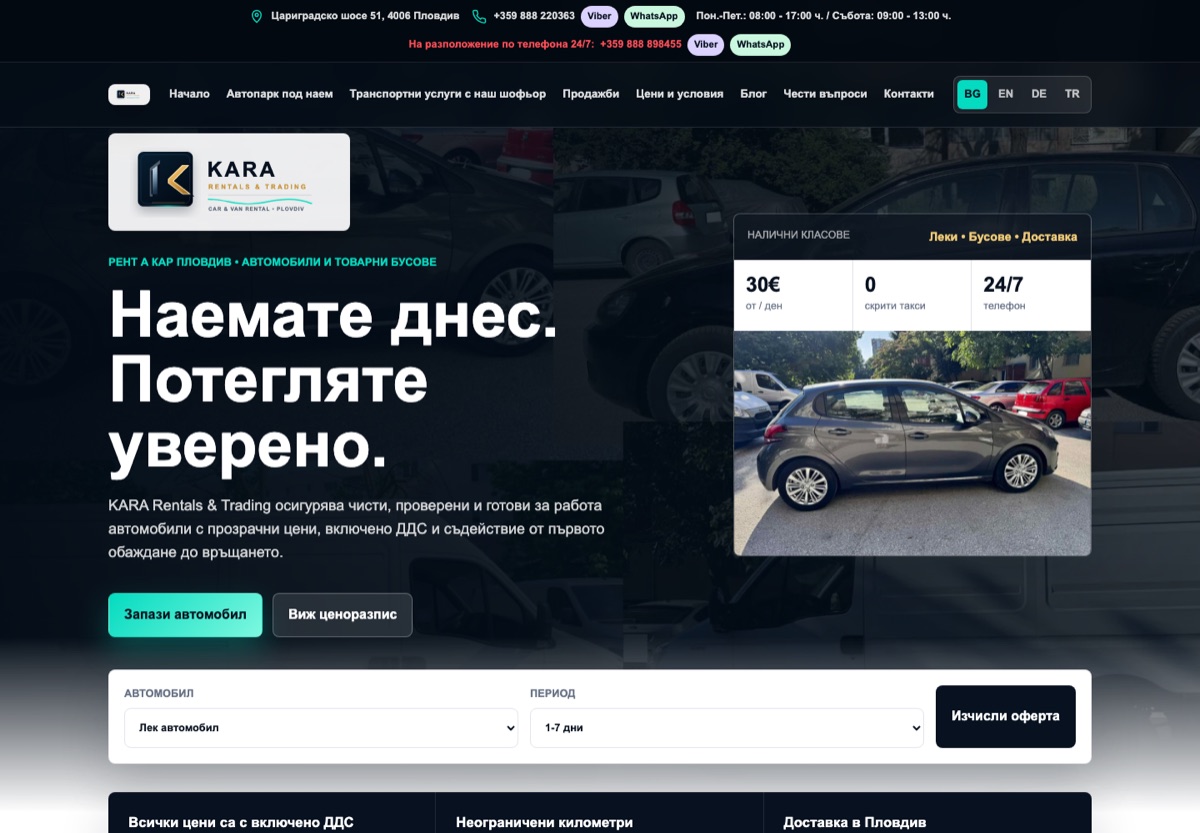
The brief: explain the service before asking for an enquiry
The original project focused on a clear offer, mobile navigation, service categories and direct contact actions. A visitor needs to understand what is available and which information to send. That gives the website a practical sequence: recognise the service, narrow the choice, review the terms, then contact the business. The original Bulgarian project overview documents this approach.
Structure the choice around the customer's task
The public fleet section separates cars, minivans, cargo vans, platforms and trailers. Cards combine photographs, specifications and contact actions.
For a service website, a category should help a visitor decide. A useful specification answers a practical question: will this option fit the job? Repeating a small set of information across cards makes comparison possible before a conversation starts. The same principle can guide equipment hire, appointments or other services with several options.
Keep price information and confirmation clear
The price list distinguishes rental periods and deposits. The calculator estimates rental and deposit amounts from a vehicle class and duration. Availability and booking terms are confirmed with the business.
An estimate is useful when its assumptions are visible. For a similar project, define the rate periods, what the total includes and where a person must confirm the request before building the interface. A calculator also creates a maintenance responsibility: when the offer changes, its rules and the written price list need to be reviewed together.
Make the language choice part of the journey
The client website publishes Bulgarian, English, German and Turkish page links. Its English page includes service information, prices and enquiry labels.
Planning a multilingual website means checking the whole route to contact. Translating the headline alone leaves gaps. For each agreed language, a project checklist should cover navigation, option names, explanations, form feedback and the text around the final action. Later content changes also need an owner so the versions stay consistent.
Collect enough context for a useful reply
The enquiry form asks for contact details, service, vehicle, dates, pickup information and a description. It explains that submission requires no payment; direct telephone links are also available.
Each field should support the next conversation. For another service business, start with the questions needed to assess availability and scope, then separate essential details from optional explanation. The design review should include keyboard use, narrow screens, validation and error recovery as well as the completed form.
What this case study establishes
This is a documented website project with a public client site. The implementation discussion covers the visible customer journey. Revenue, conversion rates, search rankings, reservation completion and inbox delivery have not been measured for this case study. The public interface alone cannot establish those outcomes.
For a new project, the next step is to agree which actions matter and how successful enquiries will be verified. That keeps design decisions connected to a business process and gives later improvements a measurable purpose.
Public features reviewed on . Explore KARA RT in English.